Once you start looking at the world from the perspective of user-experience (UX) it changes everything*
I’ve been living in a UX mindset for some time now; the catalogue of #UXFAILs growing by the hour. In fact a great deal of what I now experience now seems poorly designed. And I’ve begun to notice that there are classes of #UXFAIL – systematic errors in the way people design things. I thought I would list some of these – a kind of first attempt at a species tree for UX failure, if you like.
*(If you think UX is something to do with web-page design, then let me clarify: UX is about looking at life from the point of view of someone trying to engineer a perfect, ‘frictionless’, experience. It’s about asking ‘What if?’ in a systematic way. This kind of thinking helps us to notice all the ridiculous things that we have endured for so long that we stopped noticing them and began taking them for granted: like queues or stickers on apples.)
Asymmetry:

Why do you queue? Sometimes you queue on a phone call, sometimes in a store. Imagine getting to the front of the queue and saying ‘Can you just wait there for a few minutes while I finish this email?’ Why is that unacceptable?
It is because there is an asymmetry in the relationship: someone has something you can’t get more easily elsewhere, and to the extent that they hold this power over you, the more they can afford to degrade your experience so they can spend less money. We try to ‘self-repair’ our queue UX by using our mobile devices. But this can’t last: you don’t queue in iTunes - and HMV goes out of business. A lot of high-street retail still exists because parcel-delivery is slow and dysfunctional. Consumer-oriented societies tend to reduce queue length, since they tend to offer choice where it doesn’t exist. Wherever you see a queue – there’s a business opportunity.
Functionalism:


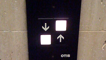
This is a huge source of broken UX; it stems from the idea that a good system is one that has all the right functionality. And this is wrong – a good system is one which is easy to use. This explains why – despite being given a Samsung Note 3 (which had a hover pen with a button on it – A HOVER PEN WITH A BUTTON!!) I never bothered charging it. It had all the functionality but was pretty much unusable. I used my iPhone which had much less functionality but which was good to use.
Today, companies around the world are procuring IT systems that their employees will never use. Those companies will wring their hands and try to force people to use these systems in order to justify their investment. It is never a good thing for a company to be locked in a battle with its employees. But this happens because their procurement process is based on an assessment of functionality rather than UX, and because the companies who develop these systems develop functionality not UX. Billions of dollars are wasted this way.
Thoughtlessness:


Let’s face it – some things are just poorly designed. The ‘designer’ didn’t really think about the user. This is not, by itself, the end of the story – most designs are wrong first time round – but they didn’t notice the design was crappy and go back and improve it. They failed to iterate.
I often see glass doors with “PULL” printed on the other side. Because our brains read text automatically – even in reverse – we sometimes mistakenly pull the door because this is easier than thinking ‘That says pull, but the text is reversed, therefore it must read ‘pull’ normally from the other side, meaning that I should ‘push’ from this side’. The first person who designed a door this way could have noticed this error and improved the design. But they didn’t.
Egocentricity:

Big companies – like Siemens, the BBC and GE – do this kind of thing a lot. They design stuff for themselves. But because they hire people who aren’t really representative of the average user, they are baffled when people don’t buy or ‘get’ their products. Siemens’ engineers designed a desk phone with hundreds of functions – which were all so incredibly complex to access via the multi-level menu system that all people ever did was make & receive calls. Until the introduction of ‘FastWorks’ GE would routinely develop products that nobody wanted… because they didn’t involve their customers in the design. Historically, the BBC tends to make programmes for ‘creative London Liberals’, often leaving large sections of their audience alienated.
Convention:

A lot of UX has been broken for so long that we just stop noticing that it could be better. I’ve just finished my meal at a restaurant. It’s time to catch the eye of the waiter. This takes ten minutes. I tell him I want to pay the bill. Ten minutes later he returns with the bill, which he drops on the table. I place my card on the small silver tray, on top of the bill. Five minutes later he returns and says ‘oh – you wish to pay by card – I will go and get the machine’. Five minutes later he returns. I pay by card. Despite this being an extra-ordinarily dysfunctional UX, people have accepted it for decades.
Aesthetic:


There is a kind of design which focuses on aesthetics at the expense of usability: the designer of the bathroom tap decided to keep the design as simple as possible, free of levers you can turn or pull. How does it work? Does it by waving your hands in the vicinity of the tap? No. By pushing the tap? No. Is it voice activated? No. Several minutes of experimentation later you discover that you have to press the head of the tap inwards for water to flow. Looks good – works like crap. The elaborate plumbing style preferred in the other example looks great, in an elegant Victorian sort of way. Ten minutes of alternately dousing yourself in scalding or freezing water can clarify your perspective, however.
Bureaucracy:

Bureaucracy is a kind of systematic degradation of UX in the interests of maintaining power gradients. People are prevented from changing banks, from switching energy supplier, from changing mobile phone network by immense bureaucratic hurdles which make the experience so tiresome and complicated that it is easier not to bother. A house-sale is so incredibly bureaucratic that one is forced to engage the services of multiple professionals skilled in the art of bureaucracy.
Idealisation:

Education is a kind of broken UX based in part on convention but mainly on an ideal: namely that learning takes place when one person talks and another one listens. This ‘idealised’ picture of learning in turn gives rise to all manner of rituals, which lead to people sitting in classrooms for decades, feeling bored and learning next to nothing. It really is an extraordinarily misguided abuse of time – based on a flawed model of learning.
Legacy:


Some UX is broken because legacy systems (technology/legal/) haven’t caught up with technology+culture. Email is like this: a company has a clunky system of email which employees simply bypass using their own means of communication. Guess what? There’s a policy about email usage that goes with the system that everyone is ignoring as well. Apparently someone is working on a social media policy for release in 2020. This is the kind of broken UX where you see users flowing round the problem, rather than accepting it.
‘Satisficing’:


Which happens where someone compromises a design in the interests of some other end such as ‘finishing on time’ or ‘sticking to the budget’ or ‘meeting the requirements’. This is not the same as thoughtlessness – often the designer will be aware that the design has been compromised – they just don’t care. This tends to happen when they are removed from the actual user either physically or psychologically (e.g. by layers of bureaucracy). A significant factor in Apple’s success has been an uncompromising stance towards design – even at the expense of deadlines and budget.
Often these failures go hand-in-hand: big, bureaucratic organisations tend to be egocentric in their design approach, for example. Finally - I am sure there are many other sources of design failure - please let me know about them!
No comments:
Post a Comment